


What is Glassmorphism UI Design and How To Create it in Figma
Over the years, in a bid to create more interesting interfaces, several UI trends have emerged, from Skeuomorphism to Neomorphism, and her we talk about Glassmorphism. Catching up with these trendy design practices is one important duty of any passionate UI designer.
Glassmorphism is a popular UI trend that enables designers to create designs that have the look and feel of frosted glass. This UI trick adds more dimensionality to your designs and if used correctly can help you create really beautiful interfaces.
In this article, you will learn how to create the Glassmorphism UI design in six easy steps by creating a simple card. But before then let's take a thorough look at the meaning and the evolution of this UI trend.
What exactly is glassmorphism?
Glassmorphism, a term coined by Michal Malewicz in 2020, simply involves achieving a glass-looking effect by combining transparency and background blur; it is popularly used with cards. This polished look when combined with an appropriate background produces a blurry effect.
Origin of glassmorphism
The glassmorphism style didn't start in 2020, in a way, we can trace it to as far back as the early 2000s — the beginning of Skeuomorphism.
Skeuomorphism is a UI trend in which designers try to mimic natural or real-world elements. The goal of Skeuomorphism is to depict physically occurring objects in a design. Through this, designers can make interfaces that people find similar to the real world making interaction with them easier.
For instance, by creatively combining effects like gradients, shadows, etc, designers can create interfaces that appear like wood, metal, flames, etc. These depictions in UI add richness to the user experience. Asides from effects, using icons like the recycle bin and floppy disk for save buttons are other popular skeuomorphic concepts.
The Glassmorphism effect, before it was called that, was already being used by big brands such as Apple and Windows to achieve all kinds of UI features.
Apple, when they released iOS7 in 2013, had translucent gray backgrounds with a light blur to the icons beneath them present in iPhones. In 2020, Apple made the glassmorphism background style popular again with the MacOS Big Sur update which had glassy drop-down menus and translucent sidebars.
Microsoft Windows is also heavy on the trend. The Acrylic Design system and Windows OS both make use of glassmorphism in establishing visual hierarchy.
Major characteristics of glassmorphism
Transparency: this is how the UI achieves the frosted-glass effect (when combined with a background blur). Glassmorphism relies on making objects transparent so that the background or object beneath them will appear blurred.
Multi-layered structure: it is important to add a multi-layered 3d illusion to glassmorphism backgrounds, this adds a feeling of realness to the design making the objects appear like actual glass objects and bringing the other elements in the interface into contrast.
Vivid colors for the hazy transparency: glassmorphism stands out with vivid background colors. If dull solid background colors or images are used, then the transparency will only result in neutralizing the hazy effect.
Light borders on a translucent interface: a light border adds to a glass edge illusion and it can make your design stand out more. However, it's important to not overuse this as that can distract from the interface itself.
How to create Glassmorphism UI
Now that we have gotten all that out of the way, let us get to the interesting part: there are two main ways to create glassmorphic backgrounds.
Method 1: creating glassmorphism in Figma from scratch
To illustrate the glassmorphism UI style, we will use Figma to create a basic card in six easy steps.
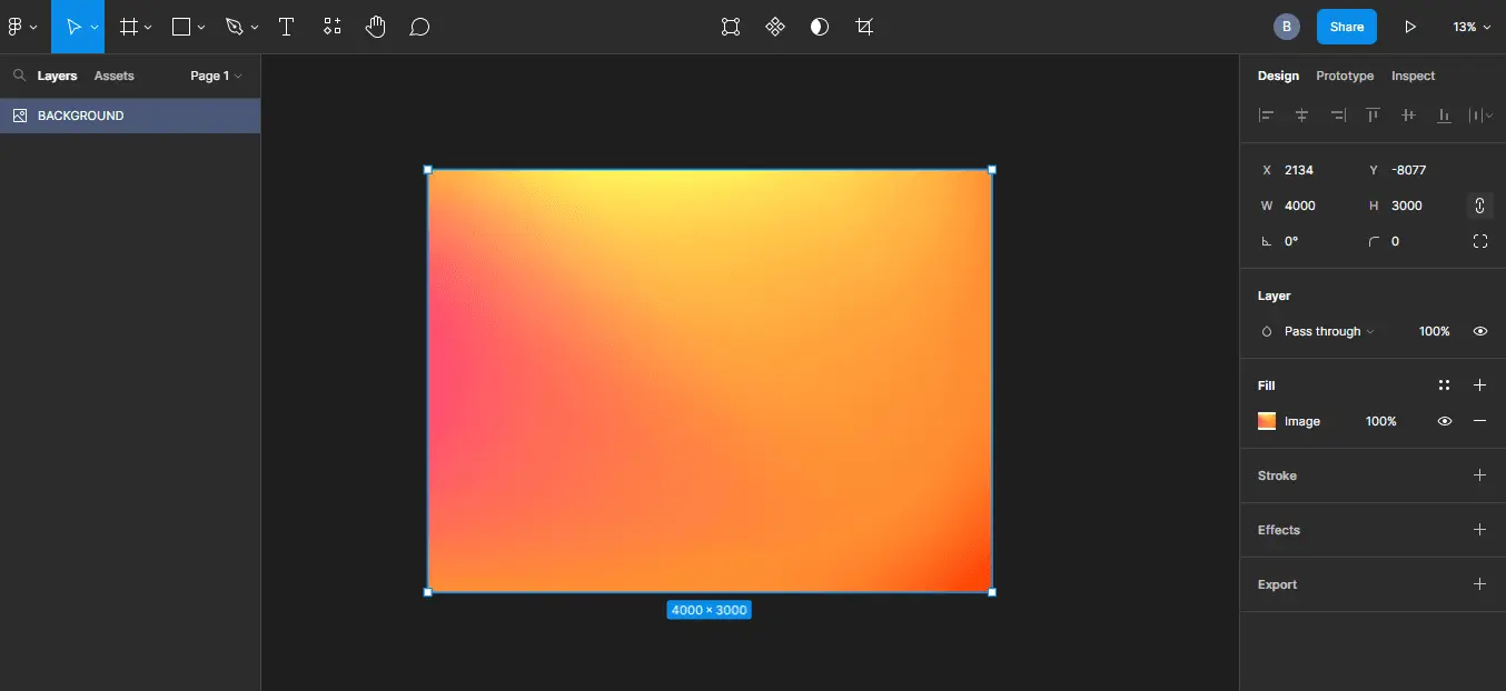
Step 1: background
The background can make or mar your glassmorphism design. It is essential to use a background that brings the blur effect to focus. For this tutorial, we will use a gradient-colored background. You can download such backgrounds for free here.
Follow the steps below to set up a good background for your glass interface
- Download a good background image to your computer.
- To import an image to Figma, select Files ➡ Place image, select the background from your file explorer.
- Now, set the size of the image to 4000px by 3000px
Step 2: Create a card
Now that we have a background ready, it's time to create the card we will apply the glassmorphism UI design to. We are going to use a Frame:
- Select the Frames icon from the toolbar, alternatively, you can use the shortcut: ctrl + F.
- Then drag your mouse across the background.
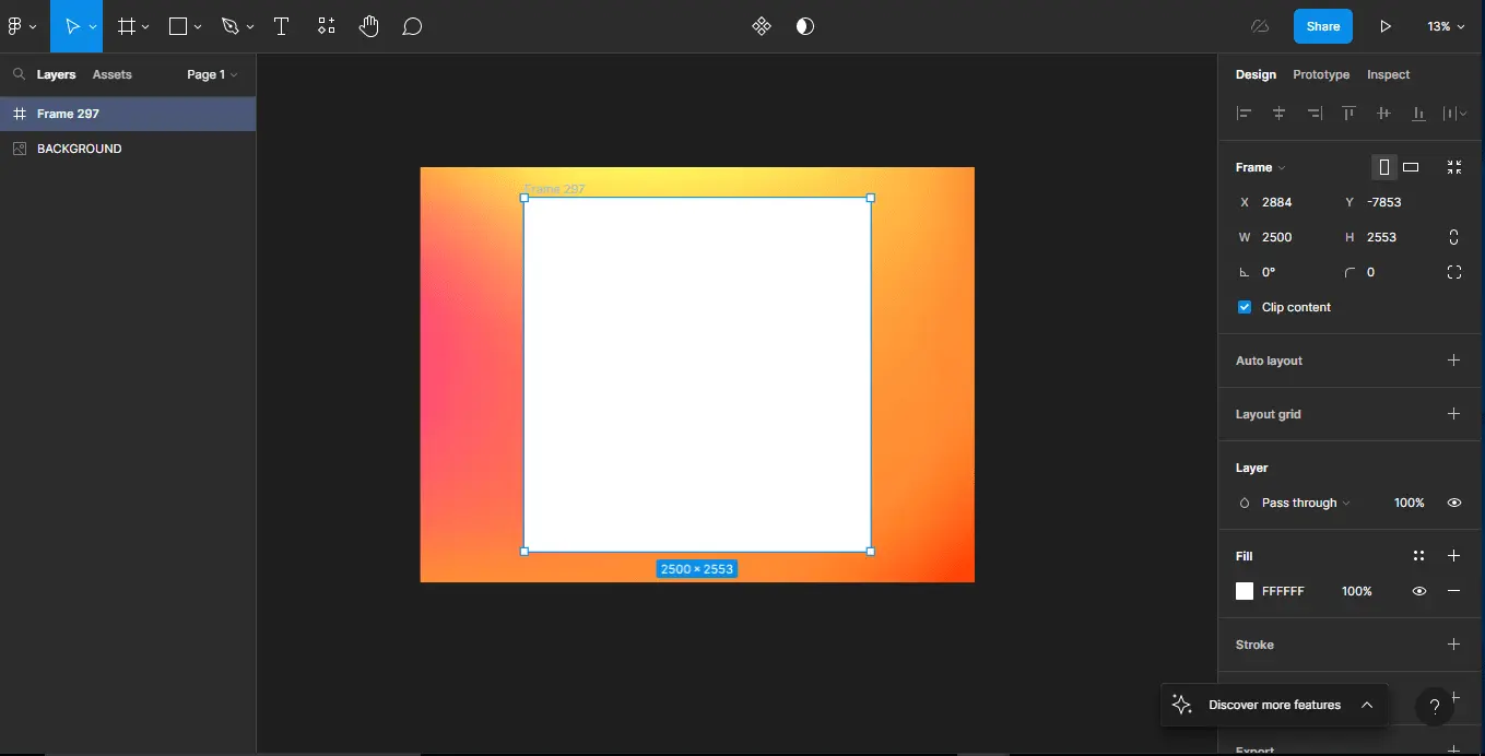
- We are going to set this shape to a width and height of 2500px by 2553px.
- Finally, to give it a more polished look, let's add some corner radius; on the right side of the editor, select the corner radius icon ➡ and set the radius to 50.
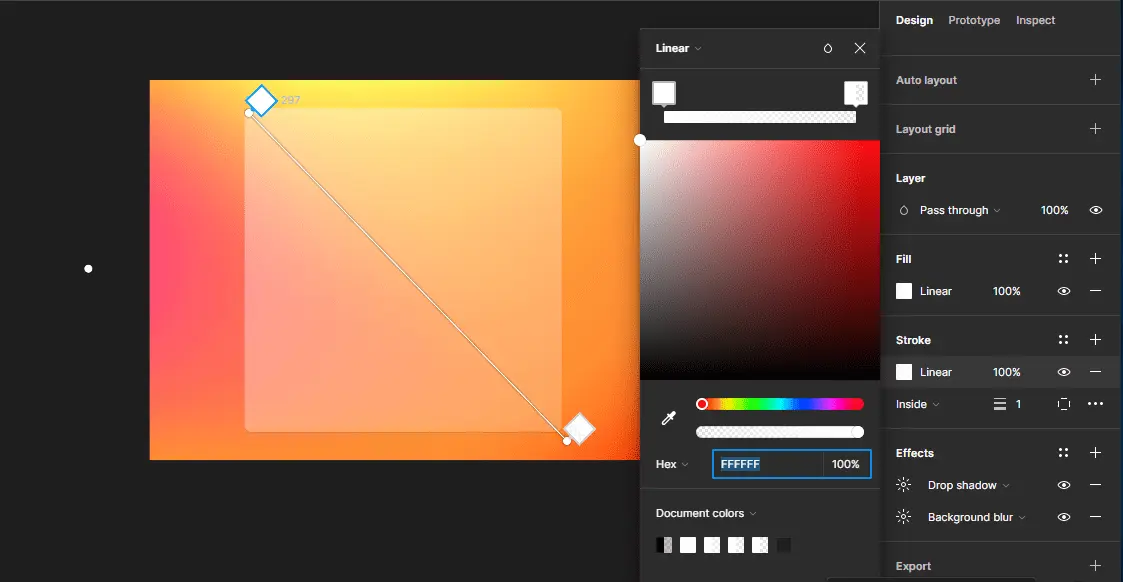
Step 3: Add a linear gradient
Now, we need to add a linear gradient to the frame. This will give it the transparent glass look that the UI style is known for. For the gradient, we will use white as the color on both sides. Then we will give this a transparent fill.
Do the following:
- Select the Fill property on the right side of the editor i.e the Frame properties section.
- From a drop-down menu in the resulting dialog choose Linear gradient.
- Set the two colors as #FFFFFF
- For the first color, set the transparency to 40; set the second to 20. Obviously, you can play around with different settings.
As you can see from the above screenshot, the frame is already looking like a glass surface. The background also adds nicely to the illusion.
Step 4: add background blur
To achieve the hazy effect we need to add a blur property to our frame. This is as simple as setting the background blur property to a suitable range — not too much as that will affect the translucency, also, too little wouldn't make much difference. Though, as with most of the other properties, you can play around with different settings.
To apply background blur to the frame, do the following :
- On the Frame properties on the right side of the editor, under the Effects section, add an effect by clicking the + icon.
- Open the drop-down menu and select Background blur.
- Set it to 30.

While this might not be so evident now, the blurry effect is more likely to be noticed when there are objects behind the Frame.

Step 5: add drop shadow
To add a 3D object feel to our frame, we need to add a drop shadow property to it. However, it is necessary to do this with moderation as too much of it can distract users from the glassmorphism UI itself.
To apply a drop shadow to the frame, you can do the following:
- In the Effects section of the Frame properties, click the add effects + button. This will add a default Drop shadow option to the frame.
- To adjust these default properties, open the properties menu by clicking the link icon.

Step 6: add stroke with a linear gradient
Glasses usually have sharp edges. To give the frame a more glass-like look we can add a subtle stroke to it. It is important to make this subtle and neutral color— preferably with a gradient fill to not draw much attention to it.
To add a stroke with a neutral color, follow the steps below:
- In the Frame properties, click the + button for the Stroke property, we can leave it at its default thickness, and make sure to choose an internal stroke instead of the default.
- Set the color of this Stroke to a linear gradient by clicking on the Color property ➡ select Linear from the drop-down menu ➡ chose #FFFFFF as the two colors for the gradient.
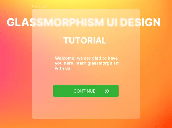
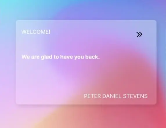
Add content
To bring our design to life we need to add some components to it. Using white text on a glass background requires us to be concerned about accessibility, in the image below we have made the text bold to provide enough contrast.

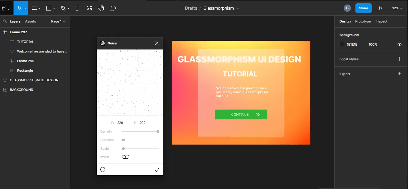
Add noise
To finish off with the glassy feel we can add some noise to our frame, this will make it appear more realistic. You can add this using an image or you can use a Figma plugin to do the same.
Simply do the following:
- Install the noise plugin.
- Left-click on a frame ➡ select plugins ➡ noise.
- Tweak the properties until you have a rough surface that is subtle but noticeable.
- Select the ok icon and the noise plugin will generate a surface you can place on your design.
Method 2: creating glassmorphism in Figma using a UI toolkit
UI toolkits help designers quickly achieve their design goals. Starting a design from scratch might not always be a productive thing to do. Although glassmorphism is a simple UI style to implement—as you have already seen, it might be helpful instead to use a UI toolkit instead.
The good thing about this approach is that most UI design kits give you the flexibility to modify components to your taste. So you do not have to worry about them not meeting your preferences.
Sometimes, there is really no need to reinvent the wheel.
So, let us install a simple glassmorphism UI kit from the Figma community and see how we can use it.
- Open the Figma community by clicking on the Home icon in the Figma tool or through this Link.
- Type "glassmorphism" into the search bar.
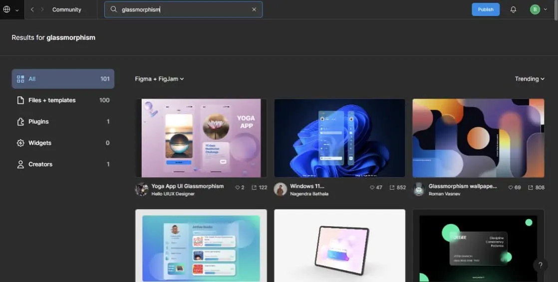
- Select and install a file of your choice. We have installed Glassmorphism_All In one.
- Open the installed project in the Figma editor.
You can simply copy and paste or duplicate glass components and objects to your other design files.
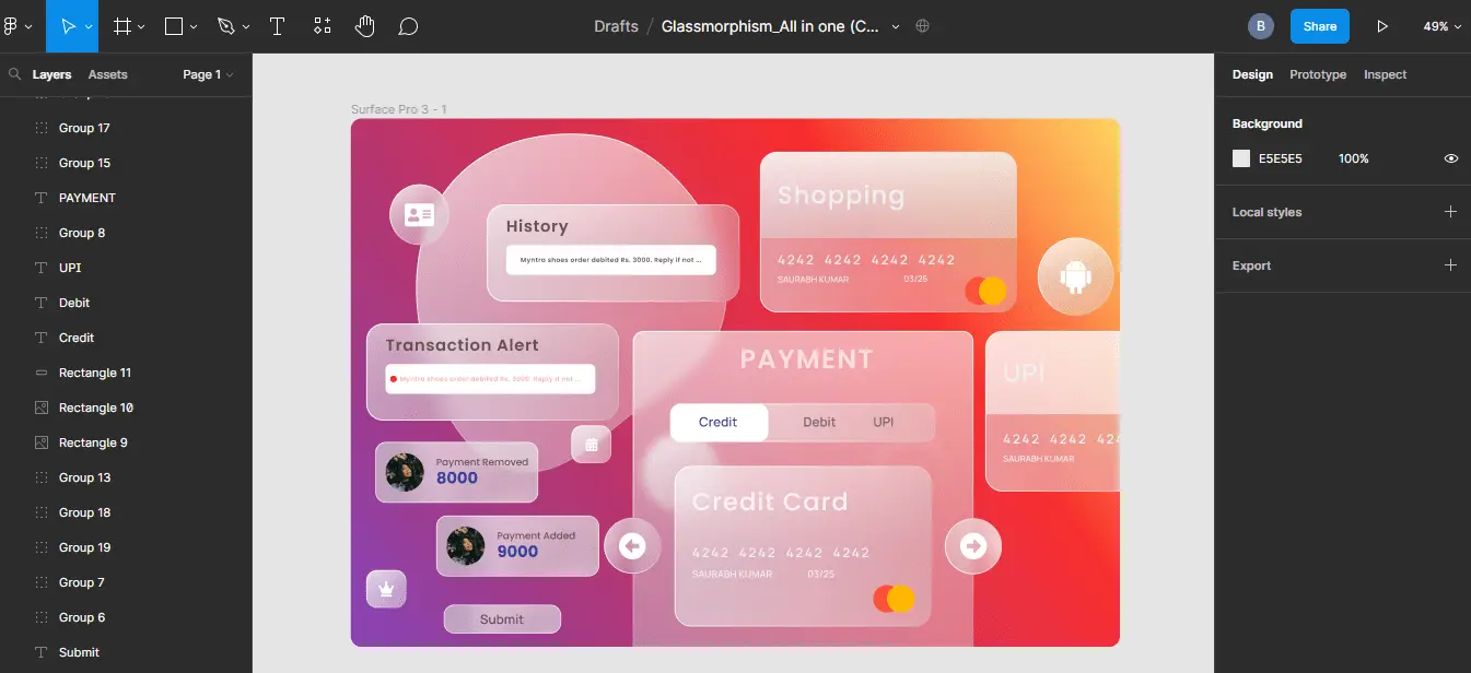
Note: when duplicating components in Figma it might be helpful to detach them from the original components before you can freely modify them. To detach a component in Figma:
- Right-click on the component.
- From the popup menu, select the detach component option.
To modify the transparency or other features of the component simply:
- Click on the component.
- In the properties section, change the property of interest to suit your preference.

This is simple and could be a time saver, especially when working on large projects or when you need to increase your productivity as a UX freelancer.
Should I use glassmorphism?
Like most design trends, it is best to use them in moderation as there can be accessibility concerns if overused. For instance, you can use glassmorphism UI design for cards and as background for other cards but making every element on the card appear just like the glass background is a bad practice as it results in a lack of a visual hierarchy.
Another accessibility factor to consider while using this UI style is contrast. Having faint letters appear on a blurry surface might end up being difficult to read. Therefore it's important to consider the visual weight of the elements placed on the glassy surface.
Finally, when implementing glassmorphism UI design, it might be helpful to be aware of important UI design principles that can help you stay on track in creating impactful designs.
What is the difference between glassmorphism and neumorphism?
Neumorphism is a minimalist style of design that combines elements of skeuomorphism and flat design, this UI trend involves using monochromatic colors, soft shadows, and low contrast to achieve effects popularly referred to as soft UI.
Glassmorphism UI relies on making components on a rather busy background translucent, and it is a more minimalist UI design style than neumorphism.
Conclusion
Every UI designer needs to be adept in all the trending UI styles at every given time, given that the field is fast-paced with several trends emerging seemingly from nowhere, some top UI trends like glassmorphism are widely known thanks to their adaptation by top brands in the industry, therefore it is helpful to use something users appreciate.
Blog
Marketplace
Secured payments


